dynamic-themes-with-codemirror
Learn how to create a Lit web component with CodeMirror, dynamically themed using Material Design's color utilities, for a customizable code editing experience.
What this skill does
# Dynamic Themes with CodeMirror
In this article I will go over how to set up a [Lit](https://lit.dev/) web component and use it to create a a code window that uses [CodeMirror](https://codemirror.net/) and apply a dynamic theme with [Material Design](https://material.io/).
> **TLDR** The final source [here](https://github.com/rodydavis/codemirror-dynamic-theme) and an online [demo](https://rodydavis.github.io/codemirror-dynamic-theme/).
## Prerequisites
* Vscode
* Node >= 16
* Typescript
## Getting Started
We can start off by navigating in terminal to the location of the project and run the following:
```
npm init @vitejs/app --template lit-ts
```
Then enter a project name `codemirror-dynamic-theme` and now open the project in vscode and install the dependencies:
```
cd codemirror-dynamic-theme
npm i lit codemirror @material/material-color-utilities
npm i -D @types/node @types/codemirror
code .
```
Update the `vite.config.ts` with the following:
```
import { defineConfig } from "vite";
import { resolve } from "path";
export default defineConfig({
base: "/codemirror-dynamic-theme/",
build: {
rollupOptions: {
input: {
main: resolve(__dirname, "index.html"),
},
},
},
});
```
## Template
Open up the `index.html` and update it with the following:
```
<!DOCTYPE html>
<html lang="en">
<head>
<meta charset="UTF-8" />
<link rel="icon" type="image/svg+xml" href="/src/favicon.svg" />
<meta name="viewport" content="width=device-width, initial-scale=1.0" />
<title>CodeMirror Dynamic Theme</title>
<script type="module" src="/src/code-window.ts"></script>
<style>
body {
margin: 0;
padding: 0;
}
</style>
</head>
<body>
<code-window> </code-window>
</body>
</html>
```
## Web Component
Before we update our component we need to rename `my-element.ts` to `code-window.ts`
Open up `code-window.ts` and update it with the following:
```
import { html, css, LitElement, unsafeCSS } from "lit";
import { customElement, property } from "lit/decorators.js";
import {
applyTheme,
argbFromHex,
hexFromArgb,
themeFromSourceColor,
} from "@material/material-color-utilities";
import CodeMirror from "codemirror";
import codemirrorStyles from "codemirror/lib/codemirror.css";
@customElement("code-window")
export class CodeWindow extends LitElement {
static styles = css`
${unsafeCSS(codemirrorStyles)}
main {
width: 100vw;
height: 100vh;
background-color: var(--md-sys-color-background);
color: var(--md-sys-color-on-background);
--header-height: 48px;
--input-size: 32px;
}
.toolbar {
height: var(--header-height);
background-color: var(--md-sys-color-primary-container);
color: var(--md-sys-color-on-primary-container);
display: flex;
align-items: center;
}
.actions > * {
margin-left: 4px;
margin-right: 4px;
}
.toolbar .title {
font-family: sans-serif;
font-size: 18px;
padding-left: 4px;
}
.toolbar .actions {
display: flex;
align-items: center;
}
.toolbar a {
padding: 0;
margin: 0;
padding-left: 8px;
padding-right: 8px;
display: flex;
align-items: center;
cursor: pointer;
}
input[type="color"] {
width: calc(var(--input-size) * 2);
height: var(--input-size);
outline: none;
border: none;
border-radius: 50%;
background-color: var(--md-sys-color-primary-container);
}
input[type="color"]::-webkit-color-swatch-wrapper {
padding: 0;
}
input[type="color"]::-webkit-color-swatch {
border: none;
border-radius: var(--input-size);
border: var(--md-sys-color-outline) solid 1px;
}
button {
border: none;
border-radius: 4px;
padding: 8px;
}
.tertiary {
background-color: var(--md-sys-color-tertiary);
color: var(--md-sys-color-on-tertiary);
}
.secondary {
background-color: var(--md-sys-color-secondary);
color: var(--md-sys-color-on-secondary);
}
.spacer {
flex: 1;
}
.editor {
height: calc(100% - var(--header-height));
width: 100%;
}
`;
@property() value = [
`import {html, css, LitElement} from 'lit';`,
`import {customElement, property} from 'lit/decorators.js';`,
``,
`@customElement('simple-greeting')`,
`export class SimpleGreeting extends LitElement {`,
` static styles = css\`p { color: blue }\`;`,
``,
` @property()`,
` name = 'Somebody';`,
``,
` render() {`,
` return html\`<p>Hello, \${this.name}!</p>\`;`,
` }`,
`}`,
].join("\n");
@property() color = "#6750A4";
@property({ type: Boolean }) dark = window.matchMedia(
"(prefers-color-scheme: dark)"
).matches;
render() {
return html`<main>
<header class="toolbar">
<div class="title">${document.title}</div>
<div class="spacer"></div>
<div class="actions">
<button class="secondary" @click=${this.toggleDark.bind(this)}>
${this.dark ? "Light" : "Dark"}
</button>
<button class="tertiary" @click=${this.randomColor.bind(this)}>
Random
</button>
<input
type="color"
.value=${this.color}
@input=${this.onColor.bind(this)}
/>
</div>
</header>
<div class="editor"></div>
</main>`;
}
firstUpdated() {
const root = this.shadowRoot!.querySelector(".editor") as HTMLElement;
const editor = CodeMirror(root, {
value: this.value,
mode: "javascript",
lineNumbers: true,
lineWrapping: true,
indentUnit: 4,
tabSize: 4,
indentWithTabs: true,
autofocus: true,
});
console.debug(editor);
editor.setSize("100%", `100%`);
this.updateTheme();
window
.matchMedia("(prefers-color-scheme: dark)")
.addEventListener("change", (e) => {
this.dark = e.matches;
this.updateTheme();
});
}
private updateTheme() {
// TODO: Generate Theme
}
private setColor(val: string) {
this.color = val;
this.updateTheme();
}
private onColor(e: Event) {
const target = e.target as HTMLInputElement;
this.setColor(target.value);
}
private randomColor() {
const letters = "0123456789ABCDEF";
let color = "#";
for (let i = 0; i < 6; i++) {
color += letters[Math.floor(Math.random() * 16)];
}
this.setColor(color);
}
private toggleDark() {
this.dark = !this.dark;
this.updateTheme();
}
}
declare global {
interface HTMLElementTagNameMap {
"code-window": CodeWindow;
}
}
```
Here we are setting up some of the editor basics to load in the styles needed for the basic layout.
There are also few methods that handle updating of properties on the element such as `toggleDark` and `setColor`. When you run the application you should see the following:
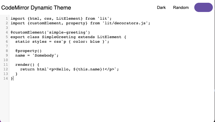
It doesn't look great yet, but now we can add a CodeMirror theme to import. Create a file `src/theme.ts` and update it with the following:
```
import { css } from "lit";
export const codeMirrorTheme = css`
.CodeMirror {
background-color: var(--md-sys-color-background);
color: var(--md-sys-color-on-background);
}
.CodeMirror-gutters {
background: var(--md-sys-color-surface-variant);
color: var(--md-sys-color-on-surface-variant);
border: none;
}
.CodeMirror-guttermarker,
.CodeMirror-guttermarker-subtle,
.CodeMirror-linenumber {
color: var(--md-sys-color-on-background);
}
.CodeMirror-cursor {
border-left: 1px solid var(--md-sys-color-primary);
}
.cm-fat-cursor .CodeMirror-cursor {
background-color: var(--md-sys-color-background);
}
.cm-animate-fat-curRelated in Design
contribute
IncludedLocal-only OSS contribution command center. Auto-refreshes the user's in-flight PR and issue state on invoke so conversations start with full context — no need to brief Claude on what's in flight. Helps the user find issues to contribute to on GitHub, builds per-repo dossiers of what each upstream expects (CLA, DCO, branch convention, AI policy, draft-first, review bots, issue templates), runs deterministic gates before any external action so AI-assisted contributions don't reach maintainers as slop. State is markdown-only: candidate files at ~/.contribute-system/candidates/, repo dossiers at ~/.contribute-system/research/, append-only event log at ~/.contribute-system/log.jsonl. No database, no cloud calls. Use when the user asks about their PRs / issues / contributions, wants to find new work to take on, claim an issue, build/refresh a repo's dossier, or draft a Design Issue or PR. Trigger with "/contribute", "what's my PR status", "find a contribution", "claim issue X", "draft a Design Issue for Y", "refresh dossier for Z".
architectural-analysis
IncludedUser-triggered deep architectural analysis of a codebase or scoped subtree across eight modes — information architecture, data flow, integration points, UI surfaces, interaction patterns, data model, control flow, and failure modes. This skill should be used when the user asks to "diagram this codebase," "map the architecture," "show the data flow," "give me an ERD," "trace control flow," "find the integration points," "verify the layout pattern," "audit the UX architecture," or any similar request whose primary deliverable is mermaid diagrams plus cited reports under docs/architecture/. Dispatches haiku/sonnet sub-agents in parallel for per-mode exploration, then verifies every citation mechanically before any node lands in a diagram. Not for one-off prose explanations of code (use code-explanation) or for high-level system design from scratch (use system-design).
mcp
IncludedModel Context Protocol (MCP) server development and tool management. Languages: Python, TypeScript. Capabilities: build MCP servers, integrate external APIs, discover/execute MCP tools, manage multi-server configs, design agent-centric tools. Actions: create, build, integrate, discover, execute, configure MCP servers/tools. Keywords: MCP, Model Context Protocol, MCP server, MCP tool, stdio transport, SSE transport, tool discovery, resource provider, prompt template, external API integration, Gemini CLI MCP, Claude MCP, agent tools, tool execution, server config. Use when: building MCP servers, integrating external APIs as MCP tools, discovering available MCP tools, executing MCP capabilities, configuring multi-server setups, designing tools for AI agents.
react-native-skia
IncludedDesign, build, debug, and optimise high-polish animated graphics in React Native or Expo using @shopify/react-native-skia, Reanimated, and Gesture Handler. Use when the user wants canvas-driven UI, shaders, paths, rich text, image filters, sprite fields, Skottie, video frames, snapshots, web CanvasKit setup, or performance tuning for custom motion-heavy elements such as loaders, hero art, cards, charts, progress indicators, particle systems, or gesture-driven surfaces. Also use when the user asks for fluid, glow, glass, blob, parallax, 60fps/120fps, or GPU-friendly animated effects in React Native, even if they do not explicitly say "Skia". Do not use for ordinary form/layout work with standard views.
plaid
IncludedProduct Led AI Development — guides founders from idea to launched product. Six capabilities: Idea (discover a product idea), Validate (pressure-test the idea against fatal flaws, problem reality, competition, and 2-week MVP feasibility), Plan (vision intake + document generation), Design (translate image references into a design.md spec), Launch (go-to-market strategy), and Build (roadmap execution). Use when someone says "PLAID", "plaid idea", "help me find an idea", "product idea", "idea from my business", "idea from my expertise", "plaid validate", "validate my idea", "pressure-test", "is this idea good", "find fatal flaws", "validate the problem", "plan a product", "define my vision", "generate a PRD", "product strategy", "plaid design", "design from image", "translate image to design", "create design.md", "extract design tokens", "plaid launch", "go-to-market", "launch plan", "GTM strategy", "launch playbook", "plaid build", "build the app", "start building", or "execute the roadmap".
nextjs-framer-motion-animations
IncludedAdds production-safe Motion for React or Framer Motion animations to Next.js apps, including reveal, hover and tap micro-interactions, whileInView, stagger, AnimatePresence, layout and layoutId transitions, reorder, scroll-linked UI, and lightweight route-content transitions. Use when the user asks to add, refactor, or debug Motion or Framer Motion in App Router or Pages Router codebases, especially around server/client boundaries, reduced motion, LazyMotion, bundle size, hydration, or route transitions. Avoid for GSAP-style timelines, WebGL or 3D scenes, heavy scroll storytelling, or CSS-only effects unless Motion is explicitly requested.